How To Use Document Fields
The document field type is a highly customizable rich text editor that lets content creators quickly and easily edit content in your system.
It's built with Slate, stores your content as JSON-structured data, and lets you do things like:
- Configure the types of formatting used in your documents
- Easily render the document in your application
- Insert relationships to other items in your Keystone database
- Define your own custom editor blocks based on React Components
To see the document field in action, try out the demo.
Configuration
The document field provides a number of different formatting options, all of which can be configured. To get started with a fully featured editor experience, you can turn on all of the built-in options.
import { list } from '@keystone-6/core';import { document } from '@keystone-6/fields-document';export const lists = {Post: list({fields: {content: document({formatting: true,dividers: true,links: true,layouts: [[1, 1],[1, 1, 1],],}),},}),};
This has enabled all of the formatting options, enabled inline links, section dividers, and both 2 and 3 column layouts.
We can disable any of these features by simply omitting the option from our configuration.
Formatting
Setting formatting: true turns on all the formatting options for the document. If you need more fine-grained control over which options are enabled, you can explicitly list the features you want, e.g.
content: document({formatting: {inlineMarks: {bold: true,italic: true,underline: true,strikethrough: true,code: true,superscript: true,subscript: true,keyboard: true,},listTypes: {ordered: true,unordered: true,},alignment: {center: true,end: true,},headingLevels: [1, 2, 3, 4, 5, 6],blockTypes: {blockquote: true,code: true},softBreaks: true,},}),
All the features set to true will be enabled in your document field. To disable a specific feature you can simply omit it from the configuration.
If you want to enable all the options in a particular sub-group, you can set the group to true. For example, to enable all listType options you could set listType: true.
You can experiment with the different configuration settings in the document field demo.
Querying
Each document field will generate a type within your GraphQL schema. The example above of a content field in the Post list would generate the type:
type Post_content_DocumentField {document(hydrateRelationships: Boolean! = false): JSON!}
To query the content we can run the following GraphQL query, which will return the JSON representation of the content in posts.content.document.
query {posts {content {document}}}
We will discuss the hydrateRelationships option below.
The document data is stored as JSON. You can use the document field demo to interactively explore how data is stored when you make changes in the document editor.
Rendering
To render the document in a React app, use the @keystone-6/document-renderer package.
import { DocumentRenderer } from '@keystone-6/document-renderer';<DocumentRenderer document={document} />;
The DocumentRenderer component accepts the JSON representation of the document returned by the GraphQL API.
Overriding the default renderers
The DocumentRenderer has built in renderers for all the different types of data stored in the JSON formatted data. If you need to override these defaults, you can do so by providing your own renderers to DocumentRenderer.
import { DocumentRenderer, DocumentRendererProps } from '@keystone-6/document-renderer';const renderers: DocumentRendererProps['renderers'] = {// use your editor's autocomplete to see what other renderers you can overrideinline: {bold: ({ children }) => {return <strong>{children}</strong>;},},block: {paragraph: ({ children, textAlign }) => {return <p style={{ textAlign }}>{children}</p>;},},};<DocumentRenderer document={document} renderers={renderers} />;
Inline Relationships
The document field can also have inline relationships which reference other items in your system. For example, you might want to include twitter-style mentions of other users in a blog application. We can achieve this with the relationships option to the document field.
import { config, list } from '@keystone-6/core';import { document } from '@keystone-6/fields-document';import { text } from '@keystone-6/core/fields';export default config({lists: {Post: list({fields: {content: document({relationships: {mention: {listKey: 'Author',label: 'Mention',selection: 'id name',},},}),},}),Author: list({fields: {name: text(),}}),},});
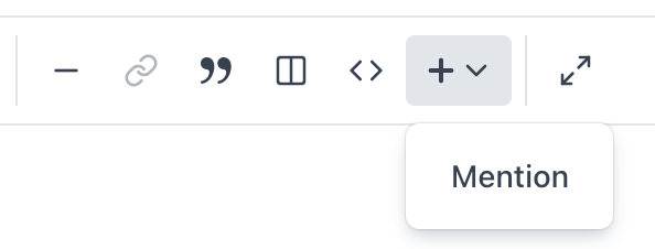
When you add an inline relationship to your document field, it becomes accessible in the Admin UI behind the + icon. This menu uses the label specified in the relationship config.

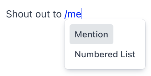
You can also access the relationship directly using the / command and then starting to type the label.

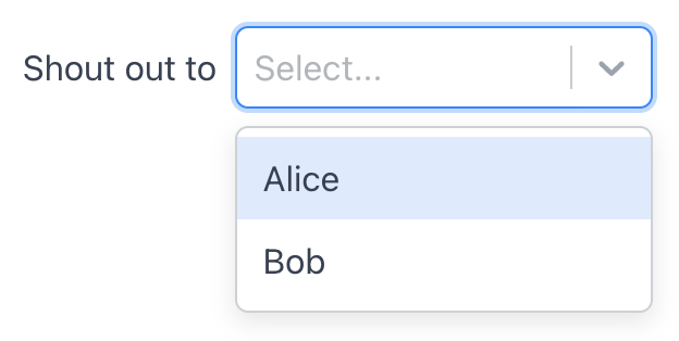
You can then select an item from the list specified by listKey from the inline select component in the document editor.

Tip: The select component will use the ui.labelField of the related list in its options list. Make sure you have this value configured to make finding related items easier for your users.
Querying inline relationships
The document field stores the id of the related item in its data structure. If you query for the document, the inline relationship block will include the ID as data.id.
...{"type": "relationship","data": {"id": "ckqk4hkcg0030f5mu6le6xydu"},"relationship": "mention","children": [{ "text": "" }]},...
This is generally not very useful if you want to render the item in your document. To obtain more useful data, we can pass the hydrateRelationships: true option to our query.
query {posts {content {document(hydrateRelationships: true)}}}
This will add a data.label value, based on the related item's label field, and a data.data value, which is populated with the data indicated by the selection config option.
...{"type": "relationship","data": {"id": "ckqk4hkcg0030f5mu6le6xydu","label": "Alice","data": {"id": "ckqk4hkcg0030f5mu6le6xydu","name": "Alice"}},"relationship": "mention","children": [{ "text": "" }},...
Null data: It is possible to add an inline relationship in the document editor without actually selecting a related item. In these cases, the value of data will be null.
Dangling references: The data for relationships are stored as IDs within the JSON data structure of the document. If an item in your database is deleted, the document field will not have any knowledge of this, and you will be left with a dangling reference in your document data. In other instances the person querying for the document may not have read access to the related item. In both these cases the data.label and data.data values will be undefined.
Rendering inline relationships
The DocumentRenderer has a rudimentary renderer built in for inline relationships which simply returns the data.label (or data.id if hydrateRelationships is false) inside a <span> tag. This is unlikely to be what you want, so you will need to define a custom renderer for your relationship.
A custom renderer for our mention relationship might look like:
import { DocumentRenderer, DocumentRendererProps } from '@keystone-6/document-renderer';const renderers: DocumentRendererProps['renderers'] = {inline: {relationship({ relationship, data }) {if (relationship === 'mention') {if (data === null || data.data === undefined) {return <span>[unknown author]</span>} else {return <Link href={`/author/${data.data.id}`}>{data.data.name}</Link>;}}return null;},},};<DocumentRenderer document={document} renderers={renderers} />;
The relationship argument lets you write renderers for each of the different relationships defined in your document. The data argument is provided directly from the query, and we can use the properies of data.data to render our mentions as links to the author's page.
Missing data: Make sure your renderer checks for data === null (no item selected) and data.data === undefined (selected item not found) and handles these cases appropriately.
Component Blocks
Component blocks let you add custom blocks to the editor that can accept unstructured content and render a form that renders arbitrary React components for input.
To add component blocks, you need to create a file somewhere and export component blocks from there
component-blocks.tsx
import React from 'react';import { NotEditable, component, fields } from '@keystone-6/fields-document/component-blocks';// naming the export componentBlocks is important because the Admin UI// expects to find the components like on the componentBlocks exportexport const componentBlocks = {quote: component({preview: (props) => {return (<divstyle={{borderLeft: '3px solid #CBD5E0',paddingLeft: 16,}}><div style={{ fontStyle: 'italic', color: '#4A5568' }}>{props.fields.content.element}</div><div style={{ fontWeight: 'bold', color: '#718096' }}><NotEditable>— </NotEditable>{props.fields.attribution.element}</div></div>);},label: 'Quote',schema: {content: fields.child({kind: 'block',placeholder: 'Quote...',formatting: { inlineMarks: 'inherit', softBreaks: 'inherit' },links: 'inherit',}),attribution: fields.child({ kind: 'inline', placeholder: 'Attribution...' }),},chromeless: true,}),};
You need to import the componentBlocks and pass it to the document field along with the path to the file with the component blocks to ui.views.
keystone.ts
import { config, list } from '@keystone-6/core';import { document } from '@keystone-6/fields-document';import { componentBlocks } from './component-blocks';export default config({lists: {ListName: list({fields: {fieldName: document({ui: {views: './component-blocks'},componentBlocks,}),},}),},});
In the document editor demo, the insertable Quote, Notice, Hero and Checkbox List items are implemented as component blocks, see the implementation for Notice, Hero and Checkbox List by expanding this.
/** @jsx */import { jsx } from '@keystone-ui/core';import { component, fields } from '@keystone-6/fields-document/component-blocks';export const componentBlocks = {notice: component({preview: function Notice(props) {const { palette, radii, spacing } = useTheme();const intentMap = {info: {background: palette.blue100,foreground: palette.blue700,icon: noticeIconMap.info,},error: {background: palette.red100,foreground: palette.red700,icon: noticeIconMap.error,},warning: {background: palette.yellow100,foreground: palette.yellow700,icon: noticeIconMap.warning,},success: {background: palette.green100,foreground: palette.green700,icon: noticeIconMap.success,},};const intentConfig = intentMap[props.fields.intent.value];return (<divcss={{borderRadius: radii.small,display: 'flex',paddingLeft: spacing.medium,paddingRight: spacing.medium,}}style={{background: intentConfig.background,}}><NotEditable><divcss={{color: intentConfig.foreground,marginRight: spacing.small,marginTop: '1em',}}><intentConfig.icon /></div></NotEditable><div css={{ flex: 1 }}>{props.fields.content.element}</div></div>);},label: 'Notice',chromeless: true,schema: {content: fields.child({kind: 'block',placeholder: '',formatting: 'inherit',dividers: 'inherit',links: 'inherit',relationships: 'inherit',}),intent: fields.select({label: 'Intent',options: [{ value: 'info', label: 'Info' },{ value: 'warning', label: 'Warning' },{ value: 'error', label: 'Error' },{ value: 'success', label: 'Success' },] as const,defaultValue: 'info',}),},toolbar({ props, onRemove }) {return (<ToolbarGroup>{props.intent.options.map(opt => {const Icon = noticeIconMap[opt.value];return (<Tooltip key={opt.value} content={opt.label} weight="subtle">{attrs => (<ToolbarButtonisSelected={props.intent.value === opt.value}onClick={() => {props.intent.onChange(opt.value);}}{...attrs}><Icon size="small" /></ToolbarButton>)}</Tooltip>);})}<ToolbarSeparator /><Tooltip content="Remove" weight="subtle">{attrs => (<ToolbarButton variant="destructive" onClick={onRemove} {...attrs}><Trash2Icon size="small" /></ToolbarButton>)}</Tooltip></ToolbarGroup>);},}),hero: component({preview: props => {return (<divcss={{backgroundColor: 'white',backgroundImage: `url(${props.fields.imageSrc.value})`,backgroundPosition: 'center',backgroundSize: 'cover',display: 'flex',flexDirection: 'column',fontSize: 28,justifyContent: 'space-between',minHeight: 200,padding: 16,width: '100%',}}><divcss={{color: 'white',fontWeight: 'bold',fontSize: 48,textAlign: 'center',margin: 16,textShadow: '0px 1px 3px black',}}>{props.fields.title.element}</div><divcss={{color: 'white',fontSize: 24,fontWeight: 'bold',margin: 16,textAlign: 'center',textShadow: '0px 1px 3px black',}}>{props.fields.content.element}</div>{props.fields.cta.discriminant ? (<divcss={{backgroundColor: '#F9BF12',borderRadius: 6,color: '#002B55',display: 'inline-block',fontSize: 16,fontWeight: 'bold',margin: '16px auto',padding: '12px 16px',}}>{props.fields.cta.value.fields.text.element}</div>) : null}</div>);},label: 'Hero',schema: {title: fields.child({ kind: 'inline', placeholder: 'Title...' }),content: fields.child({ kind: 'block', placeholder: '...' }),imageSrc: fields.text({label: 'Image URL',defaultValue: 'https://images.unsplash.com/photo-1579546929518-9e396f3cc809',}),cta: fields.conditional(fields.checkbox({ label: 'Show CTA' }), {false: fields.empty(),true: fields.object({text: fields.child({ kind: 'inline', placeholder: 'CTA...' }),href: fields.url({ label: 'Call to action link' }),}),}),},}),checkboxList: component({preview: function CheckboxList(props) {useEffect(() => {if (!props.fields.children.elements.length) {props.fields.children.onChange([{ key: undefined }]);}});return (<ul css={{ padding: 0 }}>{props.fields.children.elements.map(element => (<li css={{ listStyle: 'none' }} key={element.key}><inputcontentEditable="false"css={{ marginRight: 8 }}type="checkbox"checked={element.fields.done.value}onChange={event => element.fields.done.onChange(event.target.checked)}/><spanstyle={{textDecoration: element.fields.done.value ? 'line-through' : undefined,}}>{element.fields.content.element}</span></li>))}</ul>);},label: 'Checkbox List',schema: {children: fields.array(fields.object({done: fields.checkbox({ label: 'Done' }),content: fields.child({ kind: 'inline', placeholder: '', formatting: 'inherit' }),})),},chromeless: true,}),};
Fields
There are a variety of fields you can configure.
Child Fields
Child fields allow you to embed an editable region inside of a component block preview.
They can either have kind: 'inline', or kind: 'block'. This refers to what elements can be inside of them. kind: 'inline' child fields can only contain text with marks/links/inline relationships. kind: 'block' child fields contain block-level elements such as paragraph, lists, etc.
They require a placeholder which is shown when there is no text inside the child field. The placeholder is required though it can be an empty string if it'll be clear to editors that the location of the child field is editable.
By default, child fields can only contain plain text, if you'd like to enable other features of the document editor inside a child field, you can enable the features similarly to enabling them in the document field config. Unlike the document field config though, these options accept 'inherit' instead of true, this is because if 'inherit' is set then that feature will be enabled if it's also enabled at the document field config level so you can't enable features in a child field but not in the rest of the document field.
In the preview, child fields appear as React nodes that should be rendered. Note that you must render child fields in the preview. If they are not rendered, you will receive errors.
import { NotEditable, component, fields } from '@keystone-6/fields-document/component-blocks';component({preview: (props) => {return (<divstyle={{borderLeft: '3px solid #CBD5E0',paddingLeft: 16,}}><div style={{ fontStyle: 'italic', color: '#4A5568' }}>{props.fields.content.element}</div><div style={{ fontWeight: 'bold', color: '#718096' }}><NotEditable>— </NotEditable>{props.fields.attribution.element}</div></div>);},label: 'Quote',schema: {content: fields.child({kind: 'block',placeholder: 'Quote...',formatting: { inlineMarks: 'inherit', softBreaks: 'inherit' },links: 'inherit',}),attribution: fields.child({ kind: 'inline', placeholder: 'Attribution...' }),},chromeless: true,})
Note: You have to be careful to wrap
NotEditablearound other elements in the preview but you cannot wrap it around a child field.
Form Fields
@keystone-6/core/component-blocks ships with a set of form fields for common purposes:
fields.text({ label: '...', defaultValue: '...' })fields.integer({ label: '...', defaultValue: '...' })fields.url({ label: '...', defaultValue: '...' })fields.select({ label: '...', options: [{ label:'A', value:'a' }, { label:'B', value:'b' }] defaultValue: 'a' })fields.checkbox({ label: '...', defaultValue: false })
You can write your own form fields that conform to this API.
type FormField<Value, Options> = {kind: 'form';Input(props: {value: Value;onChange(value: Value): void;autoFocus: boolean;/*** This will be true when validate has returned false and the user has attempted to close the form* or when the form is open and they attempt to save the item*/forceValidation: boolean;}): ReactElement | null;/*** The options are config about the field that are available on the* preview props when rendering the toolbar and preview component*/options: Options;defaultValue: Value;/*** validate will be called in two cases:* - on the client in the editor when a user is changing the value.* Returning `false` will block closing the form* and saving the item.* - on the server when a change is received before allowing it to be saved* if `true` is returned* @param value The value of the form field. You should NOT trust* this value to be of the correct type because it could come from* a potentially malicious client*/validate(value: unknown): boolean;};
Object Fields
To nest a group of component block fields, you can use fields.object
import { fields } from '@keystone-6/fields-document/component-blocks';fields.object({a: fields.text({ label: 'A' }),b: fields.text({ label: 'B' }),});
Relationship Fields
To use relationship fields on component blocks, you need to add a relationship field and provide a list key, label and options selection. In the form, it will render a relationship select like the relationship field on lists. Similarly to inline relationships, they will be hydrated with this selection if hydrateRelationships: true is provided when fetching.
We recently updated the config API for inline relationships in component blocks. If you’re using a version prior to 2022-03-25 please read this upgrade guidance.
import { fields } from '@keystone-6/fields-document/component-blocks';...someField: fields.relationship({label: 'Authors',listKey: 'Author',selection: 'id name posts { title }',many: true,});...
Note: Like inline relationships, relationship fields on component blocks are not stored like relationship fields on lists, they are stored as ids in the document structure.
Objects
import { fields } from '@keystone-6/fields-document/component-blocks';fields.object({text: fields.text({ label: 'Text' }),child: fields.placeholder({ placeholder: 'Content...' }),});
Conditional Fields
You can conditionally show different fields with fields.conditional, they require a form field with a value that is either a string or a boolean as the discriminant and an object of fields for the values.
import { fields } from '@keystone-6/fields-document/component-blocks';fields.conditional(fields.checkbox({ label: 'Show Call to action' }), {true: fields.object({url: fields.url({ label: 'URL' }),content: fields.child({ kind: 'inline', placeholder: 'Call to Action' }),}),false: fields.empty(),});
You might find
fields.empty()useful which stores and renders nothing if you want to have a field in one case and nothing anything in another
Array Fields
Array fields allow you to store an array of another component block field type.
import { fields } from '@keystone-6/fields-document/component-blocks';fields.array(fields.object({isComplete: fields.checkbox({ label: 'Is Complete' }),content: fields.child({ kind: 'inline', placeholder: '' }),}))
Chromeless
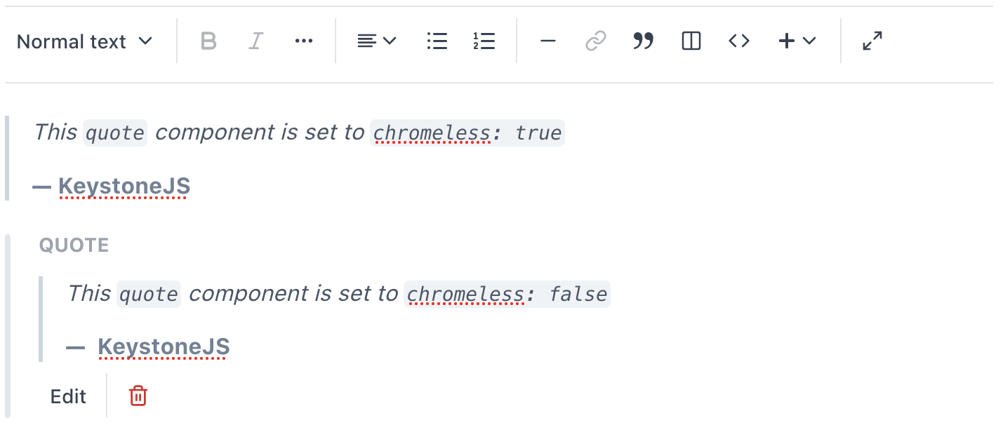
If you want to hide the default UI around your component block, you can set chromeless: true. This removes the border, toolbar, and generated form.
quote: component({preview: ({ attribution, content }) => {...},label: 'Quote',schema: {...},chromeless: true,}),
You can see the differences between each below:

In the document editor demo, the Notice and Quote blocks are chromeless, but the Hero block has the standard chrome styling.
Rendering Component blocks
Typing props for rendering component blocks
If you're using TypeScript, you can infer the props types for component with InferRenderersForComponentBlocks from @keystone-6/fields-document/component-blocks.
import { DocumentRenderer } from '@keystone-6/document-renderer';import { InferRenderersForComponentBlocks } from '@keystone-6/fields-document/component-blocks';import { componentBlocks } from '../path/to/your/custom/views';const componentBlockRenderers: InferRenderersForComponentBlocks<typeof componentBlocks> = {someComponentBlock: props => {// props will be inferred from your component blocks},};<DocumentRenderer document={document} componentBlocks={componentBlockRenderers} />;
Related resources
Example: Document Field →
Illustrates how to configure document fields in your Keystone system and render their data in a frontend application. Builds on the Blog starter project.
Example: Document Field Customisation →
Example to demonstrate customisation of Keystone's document field and document renderer.
Document Field Demo →
Test drive the many features of Keystone’s Document field on this website.